So, before I do anything else, let me define a couple of terms. First, there’s the ghastly “skeuomorphism.” According to Google, it’s simply an “element of a graphical user interface that mimics a physical object.” They offer examples from note-taking apps, such as “yellow legal pads, squared paper, ring binders, etc."
Skeuomorphs were at one time very popular parts of UIs. In fact, they were rather central in helping early users move from a world they were familiar with (e.g., the office) to one they were not.
Obviously, they can be overdone. Mimicking rich Corinthian leather for an online address book is a great example of a skeuomorphic design element that really doesn’t add anything, and that probably just gets in the way and looks a little cheesy as well.
Other examples, however, include rather valuable elements, such as radio buttons, buttons with beveled edges, and tabs. Yes, these things mimic the physical environment. But they also help the user an awful lot. That beveled edge? It says, “Click me.” The radio buttons? They say, “Click one of me.” Tabs? They say, “click me for information on the topic listed.”
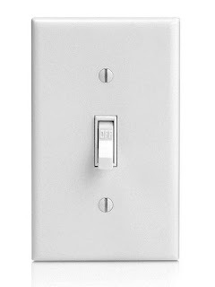
In this regard, these elements act, not just as skeuomorphs, but as “affordances” as well. And what, pray tell, are those? According to Don Norman, who first applied the term to software, affordances are “the perceived and actual properties of the thing that determine just how the thing could possibly be used.” Knobs on doors are made for turning. Light switches are made for flicking on or flicking off. Buttons are for pushing. They don’t need instructions. They’re not going to be misused.
So, where’s the problem? You can get rid of the wood grain and still make your buttons look clickable, can’t you? I mean, seriously, can’t you?
Well, according to the proponents of “flat design” (another term), you cannot. They’ve taken the horrors of faux leather and wood grain and mixed them in with the useful things, like buttons that look like buttons, field that look like fields, and tabs that look like tabs. And, unfortunately, those proponents are people with names like Microsoft, and Google, and Apple. Sigh … Hopefully, the pendulum will swing back again one of these days.
So, which light switch would you prefer to use?


"ghastly “skeuomorphism.”
ReplyDelete"Obviously, they can be overdone. "
Not for me and many other Internet Users.
I didn't realise how many "realistic" UIs had been out there until I started searching for an explanation about why rounded, shaded 3D buttons were disappearing.
- Too late to start downloading realistic interfaces !
I would have loved my desktop to appear leather-bound, notepad to have lines and a curled corner, calculator to have shadows and depth.
Flat, Minimalist is not only "ghastly" - but it has impaired the UX.
Navigation is either missing (fewer Menu items) or pure guesswork:
- Lack of borders, shaded, coloured, rounded tabs/buttons
- Plain text links indistinguishable from plain text content
- Flat, monotone, indeterminate/ambiguous icons (even worse when thin and wispy)
What has become apparent from many forums - is the huge gulf between Designers pushing (their) aesthetic (opinion) ...
... and Users who when asked, overwhelmingly reject/oppose the recent flat/minimalist design fad.
While few Users even know the word "skeumporphic", it is clear that they want more detail, more visual clues to aid navigation, than Designers are delivering - so that their UX and productivity can be restored.
I was really just referring to the word itself as "ghastly"
ReplyDelete