Wednesday, March 1, 2017

The perfect is the enemy of the good. (Voltaire)

Usability is not physics. It is not a pure science. 

Heck, even though I call myself a “usability engineer,” I know what I do is honestly pretty iffy engineering. And I should know – I put up with real engineering school for two years before calling it quits.

What usability does, however, have in common with “real” engineering is a focus on practical solutions and on real data. Now, there was a time when that data was pretty darn hard even for usability – basically, error rates and time on task. Usability engineers found, though, that that hard data was lacking an important component. That data really didn’t tell anyone why users failed, why things took so long, what project teams could do to make things better. Softer, more qualitative data, however, did.

So, you may run across clients who still insist on that hard data, especially if they have a quant background (for example, from business or marketing). In that case, you have to sell the richness of qualitative over the certainty of quantitative. And for some clients, you will definitely have to overcome the idea that qualitative data is less pure, less perfect. In those situations, I like to emphasize what we do with the data – in particular, that soft data can be a lot more actionable than hard. (It also typically eliminates the conjecture that actually comes when teams move on from gathering their hard data and then try to interpret what it means and how to come up with solutions.)

A similar issue usability engineers have to deal with has a lot to do with the numbers thing. I cover that in “Not everything that counts can be counted, and not everything that can be counted counts” (which is a quote from Albert Einstein).

Finally, there is the issue of the perfect test. And I’ve talked about that before in, “The test must go on” (I’ve got Laura Klein down for that one). 

Ultimately, the final decision can come down to running an imperfect test or never getting around to running that perfect one. And we all know that there's nothing perfect about the latter.

Usability is really the art of the possible.  We do what we can.  Like I tell my clients, give me what you’ve got, and I’ll be sure to get you something of value in return.


But then again, there’s this!

Thursday, February 9, 2017

Unfortunately, it's hard to differentiate in the software between someone who wants to go on a voyage of discovery, and someone who just wants to open a file. (Peter Flynn)

Now, what’s sad here is that I can almost guarantee that your design team (or marketing partners or senior execs) will err on the side of the former. It can sometimes be very hard for them to realize that this thing they’ve worked on, thought about, and agonized over for months, if not years, is really just a means to an end, a tool that users employ with little actual regard for the tool itself. 

Unless, that is, the tool was designed for some other purpose than to help those users achieve their goals … If, for example, it was designed with someone’s portfolio in mind, or to impress the division manager, or to get recognized in some magazine or on some website. Now, this will draw some attention to your tool. Unfortunately, at least when you’re talking about your users, that will almost always be attention of the negative kind. 

In general, users want tools that don’t draw attention to themselves. To them, your UI would be best if it were totally transparent, even invisible. 

And if your UI needs lots of training, that’s even worse. Note that that includes traditional kinds of training like manuals and videos, and more up-to-date, subtle means like coach marks and what’s-new content.

Now, of course, there are certain user types who do like to go exploring. These users are often techy types, and sometimes really do want to learn the tool and develop a mastery of it. Good for them! I’m not sure we need to develop our system around them though. Perhaps if we just offered some option so that they could go on that voyage without forcing everyone else to. Maybe a link to a tutorial, maybe an expert version of the software …

The important thing, though, is to concentrate on the user and their goals, instead of on the tool. 


Peter is at University College Cork, one of the better schools for usability in Europe

Friday, January 27, 2017

Any intelligent fool can invent further complications, but it takes a genius to retain, or recapture, simplicity. (E.F. Schumacher)

At work, most people tend to get rewarded for mastering the complex. Think of some internal system that only Joe knows how to use, some bureaucratic process that only Cheryl can understand, some hardware that only Trey can fix. Honestly, I’m pretty sure it’s behind why lawyers, accountants, and engineers all make the big bucks.

Unfortunately, for us UX types, it’s just not enough. Sure, the developers can get away with mastering C++; the lawyers with Reg this and Reg that; and project management with some unwieldy, macro-infested, homegrown spreadsheet horror. For us, though, we typically have to take all that complexity and turn it into something that our users can deal with and make sense of.

Thus, we often act as translators. So, not only do we need to learn that difficult source language of technology and bureaucracy and regulation, but we also have to translate all that into the target language of our users. 

Our effort is two-fold. First, we need to master the complex. Then, we need to turn that complexity into simplicity. 

Over the years, I’ve noticed that some UXers are great with that first part, but not with the second. To me, they’ve always seemed like frustrated techies (wolves in sheep’s clothing, if you will). Subsequently, their designs can often be great for themselves – and other techies – but maybe not so much for everybody else.

On the other hand, it’s hard to be a graphic designer without mastering PhotoShop, or an IA without being an Axure wizard, or a writer without knowing your content management system inside and out. What happens when you don’t?  Well, you might very well come up with user-friendly solutions, but you might also have a hard time translating those solutions into something workable. Heck, you might not even be able to fully grasp the complexity of the problem you’re trying to solve from the get-go, leaving out important pieces and ultimately making your solution harder, not easier, to use.

Face it, UX is one of those both-sides-of-the-brain disciplines. If your brain is structured that way, you’ll get a major kick out of both understanding the complex and then turning that it into something simple. If not, though, I can guarantee that at least one side of that equation is going to bug the heck out of ya.


E.F. Schumacher was an economist and statistician, 
but was also the author of Small Is Beautiful

Thursday, January 5, 2017

Instead of assuming that people are dumb, ignorant, and making mistakes, assume they are smart, doing their best, and that you lack context. (Nicholas Zakas)

Actually, I sometimes like to think that it’s the designer (or developer, or client, or HIPPO) who is dumb & ignorant. Needless to say, I also keep that strictly to myself.

Those are definitely my thoughts, though, whenever I hear someone put forth the traditional, “Where do you get these idiots from?” (or something along those lines). How I actually do respond is to point out these are our users, we used a 10-page screener and paid a recruiting agency $1000 to get ahold of them, and that not everyone out there is as smart and tech-savvy as you guys. 

So, that usually takes care of the “smart” part. As for the “doing their best,” we sometimes do have users who are just there for the money, but that’s extremely rare. It’s usually totally obvious to anyone observing that 99 out of 100 users are taking things seriously and are genuinely engaged.

Now, as for “context” … Hopefully, the design team had some exposure to that beforehand. Personas, journey maps, and all that other great upfront research can give the team some real feel for their users – what they do and don’t know, what they like and don’t like, what their goals and fears are – and how to design something just for them.

Even if there has been that exposure, though, I try to push testing as an excellent way to get even more context. Even the best upfront research can be incomplete, or neglected, or misapplied. Testing, though, is the chance to really check things out, to get that final word. The more sophisticated teams I work with have no problems understanding that, and often see testing in this regard as simply fine-tuning.

It’s those teams who don’t do any up-front work, and who can be totally blind-sided by things that happen in the lab, that I really worry about. Hopefully, though, these teams can use that experience to learn to emphasize with their users a little more – heck, maybe even do a little of that up-front research and avoid those uncomfortable situations in the first place.


Just in case you were wondering what a HIPPO is

Wednesday, December 14, 2016

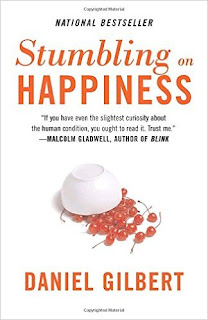
My friends tell me I always point out problems but never offer a solution, but they never tell me what to do about it. (Dan Gilbert)

I see myself as a professional scab picker. If there is a problem with your design, I’m the one who’s going to pull that scab off and make it bleed. I can do that in an eval or – better yet – let your users do that for me in a test.

So, does that make me a popular person? Well, not exactly.

Are there some things I can do to make that hurt just a little bit less? Why, yes, there are.

One thing I always try to do is to provide good results as well as bad. I’ve already written a couple of posts that address that issue (Even developers have feelings …, Don’t fear mistakes …, A successful test is one that …). 

Another, though, is to offer some solutions. If I’ve spent hours upon hours preparing for this particular test, running it, watching the tapes, sifting through all the data, then summarizing it all up in a way that makes sense to anyone, chances are some ideas are already going to occur to me. And seeing as I’ve been doing this testing thing since practically the dawn of time, I may have already run across this problem and seen a decent solution to it already.  So, why the heck not share any possible solutions I may have come up with?

Now, at the same time, I am not a designer. I may also not be totally privy to what’s already been considered and thrown out, what might not work from a business standpoint, what our competitors happen to be doing, some elegant solution that someone on the team saw in a totally different context ... In other words, I really don’t expect my solution to be adopted without any further debate. 

That said, I have, over the years, been able to cut to the chase in a few rare situations and basically offer up something that the team can adopt pretty much ready-to-wear. Saves a lot of trouble. Definitely cuts down on wheel reinvention.

Overall, though, all I really want to do is just get the ball rolling. And that, in turn, is really just totally subsidiary to my real goal here – identifying what is an actual problem, why it’s a problem, and how seriously a problem is actually might be. 


I just can't tell if it's this guy ...


... or this guy

Tuesday, November 29, 2016

A user interface is like a joke. If you have to explain it, it’s not that good. (unknown)

I’ve been doing this UX thing for about 30 years now.  In the beginning, there was a lot of explaining.  Believe me, green-screen, mainframe systems needed it badly. Most of them came with a veritable library of manuals. In fact, that’s how I got my start in this business – writing paper manuals.

My next big thing, though, was online help. Now, that was a real step up from paper manuals. At the same time, though, I found there were two different styles of help – one that was really helpful and one that was basically just throwing a manual online. The helpful version made help contextual – for example, help for a particular field that was right next to that particular field, or help for a particular page that actually appeared on that page. The unhelpful version took the user to a totally separate system, where they had to browse through what was basically a table of contents, or to scan what was basically an index. 

As the industry matured and matured, moving from software to websites to apps, I noticed that things seemed to be getting simpler and simpler – and less and less in need of explanation. It appeared that we were finally and truly moving to that holy grail of “intuitive obviousness.” 

Recently, though, I’ve noticed things taking a step back, returning to the bad old days of explanation. What I’m talking about here specifically are things, which usually appear in apps, called “coachmarks.” They’re those little boxes that might appear when you first log in, with little arrows pointing to and explaining not-necessarily-totally-obvious features. 

Now, there are some good reasons for these. For one, small screens simply have a lot less space. And that means that there might not be enough room to spell everything out. We can hope that users will explore a little, but we can’t always count on it. So why not help out by exposing a few things, right?

There are, however, also some bad reasons. For example, some apps might be trying to do too many things, and simply need to be scaled back. Some might also have too heavy an emphasis on graphic design. Left to their own devices, I’ve noticed that graphic designers sometimes opt for the “cool” and “slick” over the explicit and obvious. “Affordance” probably needs to be more of a part of those designers’ vocabularies. 

This is especially a problem when design that works for the small screen is ported – pretty much without any translation – to larger and larger screens. For example, why use a “hamburger” menu when you’ve got plenty of room to actually spell it out? As Luke W (or was it Nielsen Norman?) pointed out, “It’s mobile first, but not mobile only.” But that’s a great topic for a whole other post.


It's like a mini manual!

Thursday, October 6, 2016

To err is human. To really foul things up, you need a computer. (Paul Ehrlich?)

This one dates all the way back to the 60s. I can picture it hanging on somebody’s cubicle – maybe somebody with a white short-sleeve shirt; tie; pocket protector; dark, chunky glasses; and a lame attempt at sideburns.

Sadly, it’s still pretty accurate. Yes, we’ve come a long way [baby], but there are a number of factors that probably mean that this one will be with us always.

First of all, humans are still a lot better at certain things than computers. Now, a computer might be quite good at searching a huge database, or crunching numbers, or analyzing chess moves. Humans, though, are equally good at nuance, and vagueness, and emotion, and a different kind of complexity. Yes, with AI and machine learning, this is rapidly changing, but when it comes to the Turing Test, my money is still on the human.

Second, we need to remind ourselves that humans are still largely in charge. And what that means is that they still do the coding, and the design, and the requirements, and the QA – and basically put the darn things together. So, there’s still plenty of room for these error-prone humans to leave things out, to add in bad things, and to generally screw up the interaction between human and computer. It’s how our field got started after all. And – once again – I don’t see this going anyway anytime soon.

Finally, it seems to me that computers may also have finally passed a certain threshold. To me at least, they appear to be too complex for us mere humans to predict what they will do, how we should interact with them, what can go wrong, and how to fix them. Theoretically, we can get to the bottom of it all, but there are typically so many things in play, that it may take a lot of effort – perhaps even an infinite amount of effort – to really figure it all out.

There’s actually a book out there that speaks very specifically to this.  It’s called Overcomplicated, and is by a Silicon-Valley-type named Samuel Arbesman. I haven’t gotten to it yet, but it’s #1 on my list. It promises to “offer a fresh, insightful field guide to living with complex technologies that defy human comprehension.” Can’t wait!


Love the sideburns!